Flexibility and Efficiency of Use is about catering to all experience levels. It states that an interface should accommodate both novice users and seasoned experts. By introducing “accelerators”—speed-oriented Design patterns that are hidden from beginners—the System allows expert users to tailor frequent actions and fly through workflows, while remaining approachable and easy to learn for everyone else.
A rigid interface forces everyone to take the exact same slow path. A flexible interface morphs to fit the user’s growing competence, transforming from a simple step-by-step Guide into a high-powered utility tool as the user builds muscle memory.
The Concept of “Accelerators”
An accelerator is any user interface element or mechanism that speeds up an interaction for an expert user without cluttering the screen or confusing a novice.
- For Beginners: The interface presents clear, explicit buttons, simple menus, and guided step-by-step paths. The focus is on clarity and safety.
- For Experts: The interface unlocks shortcuts, macro operations, and customization options. The focus shifts to raw speed, throughput, and efficiency.
When implemented correctly, beginners don’t even realize these accelerators exist, meaning their learning curve is entirely unaffected, while power users can completely bypass slow click routines.
3 Core Pillars of System Flexibility
To build an interface that scales fluidly with a user’s expertise, implement these three layers of efficiency:
1. Keyboard Shortcuts and Pro-Gestures
Provide alternative, rapid input methods for actions that are repetitive or deeply embedded in menus.
- Digital Patterns: Universal hotkeys (like
Ctrl + S), application-specific shortcuts (like pressingKto pause a video), and multi-finger swipe gestures on mobile devices. - Everyday Example: Pro designers in tools like Figma or Photoshop rarely click the “Zoom” icon; they hold
Spacebar + Commandand drag their mouse to navigate the canvas instantly.
2. Personalisation and Custom Workspaces
Allow users to modify the actual user interface to put their most frequently used tools front and center.
- Digital Patterns: Draggable panels, custom quick-access toolbars, customizable sidebars, and user-defined presets.
- Everyday Example: Microsoft Excel allowing users to add their most-used functions (like “Freeze Panes” or “Conditional Formatting”) directly to the top Quick Access Toolbar.
3. Macros, Templates, and Batch Processing
Enable users to automate repetitive tasks or execute actions on multiple items simultaneously instead of forcing them to repeat the same flow one by one.
- Digital Patterns: Bulk-select checkboxes, “Apply to All” triggers, reusable document templates, and custom macro recording.
- Everyday Example: An email client allowing you to select 50 unread messages at once and click a single “Mark as Read” button, rather than forcing you to open each email individually.
Real-World Examples: The Good vs. The Bad
Let’s look at how flexibility transforms System speed.
The Good: The Command Palette Trend
Modern productivity software like Notion, VS Code, and Slack use a tool called a Command Palette. When a beginner uses Notion, they can click the floating + icon to add a block, select text options from a visual menu, and navigate with their mouse.
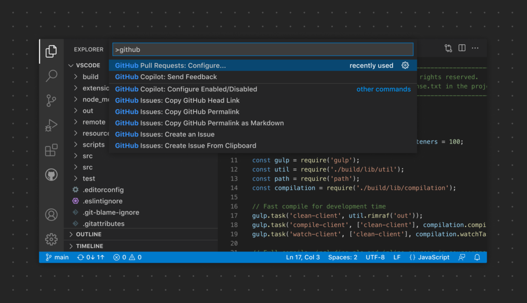
However, as they become power users, they learn to simply type /image or /table directly into the editor. Pressing a single key (/) unlocks a lightning-fast command directory right under their fingertips, eliminating the Need to ever take their hands off the keyboard.
The Bad: The Anti-Efficiency Checkout
Imagine an inventory management app used by retail workers who process hundreds of damaged item returns every single day.
To log a single returned item, the System forces the worker to click a dropdown, select a category, click a calendar widget to select today’s date, type a reason, click “Review,” and then click “Confirm.”
The app features no keyboard shortcuts, does not auto-populate today’s date, and has no “Save & Add Another” button. Because the interface is fixed into a slow, unoptimized wizard flow, a task that should take three seconds takes thirty, drastically reducing the employee’s daily productivity and causing massive user fatigue.
Further Reading & Deep Dives
To look closer at how to balance clean, minimal interface layouts with high-speed professional workflows, Explore these Resources:
- For the core principles and strategic rules of thumb straight from the source, read the Nielsen Norman Group’s Guide to Flexibility and Efficiency of Use.
- To see how to properly Design keyboard shortcuts without confusing users or clashing with browser standards, check out their article on Keyboard Shortcuts: UX Design Best Practices.
Practice Questions & Quick Quiz
Evaluate your ability to Design workflows that Support both beginners and power users.
Question 1
A photo organization app lets users add tag words to photos. To tag a batch of 100 vacation photos with the word “Holiday,” the user must click a photo, type “Holiday,” click save, close the photo, and repeat the process for the next 99 photos. What efficiency pillar is being broken here, and how would you redesign it?
- Answer Key: This completely violates the Batch Processing pillar. Forcing a repetitive, single-item Loop creates massive friction for users handling large volumes of Data. To fix this, add a multi-select capability (e.g., holding
Shiftto click multiple photos) and Provide a single “Add Tag to Selected” button to update all 100 images instantly.
Question 2
True or False: To make an interface highly efficient for power users, you should display every single available keyboard shortcut as text right next to the UI buttons at all times.
- Answer Key: False. Flooding the main interface with endless shortcut labels creates severe visual clutter, violating another core Usability rule (Aesthetic and Minimalist Design). Instead, hide shortcuts in tooltips that only appear when a user hovers over a button, or put them inside a dedicated “Keyboard Shortcuts” help sheet.
Practical Activities & UX Challenges
Put these accelerator principles into practice with these two hands-on optimization challenges.
Activity 1: The “Mouseless” Software Challenge
Pick a Complex desktop application you use for work or hobbies (like an IDE, a spreadsheet editor, a digital audio workstation, or an Advanced layout tool).
- Task: Try to complete a standard, multi-step task that you do every week (e.g., creating a formatted table, exporting a specific file layer, or searching and replacing text strings) without touching your mouse once. Rely entirely on keyboard navigation, arrows, tabs, and hotkeys.
- Deliverable: Note down the exact moments where you were forced to grab the mouse because a keyboard alternative was missing, and Identify the single most useful shortcut you discovered during the challenge.
Activity 2: Designing the “Expert Toggle” for a Data Form
Imagine you are designing an administration panel for a local secondary school or community organization. Staff use this web portal to log student details, asset logs, or Event bookings. Beginners Need plenty of descriptive text fields, inline instructions, and explicit save loops. However, power users who input 50 records a day find these explanations slow them down.
- Task: Sketch or outline a wireframe for this Data-entry dashboard.
- Requirements: Create a Design that elegantly serves both groups. Include features like:
- An optional “Compact View” or “Speed Entry Mode” toggle that collapses instructional text and reduces padding to maximize screen density.
- A smart default System that remembers the previous entries for fields like “Location” or “Date” so power users don’t have to retype them.
- A primary action button that changes to “Save & New” when a specific modifier key is held down, keeping the user in a continuous input flow.