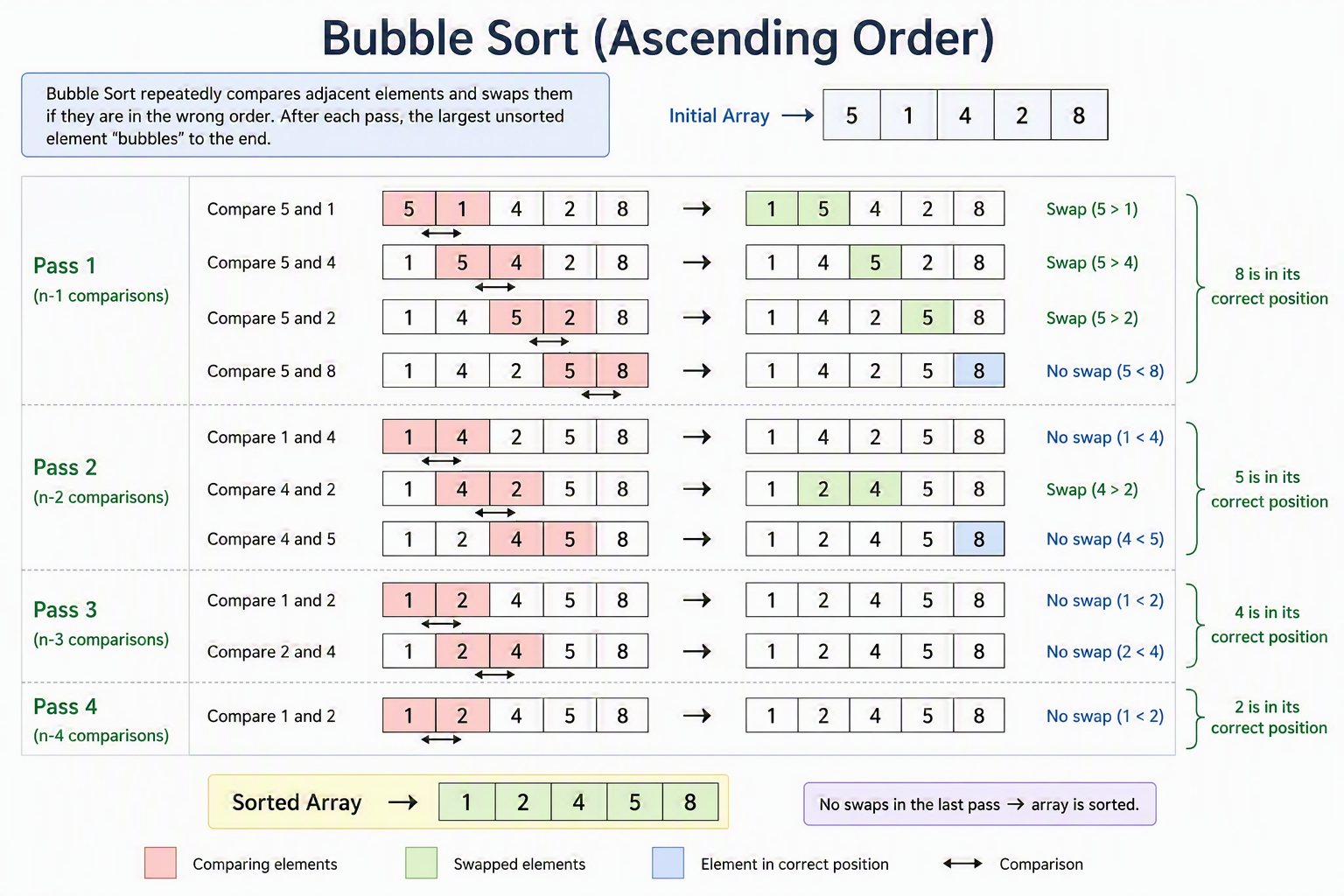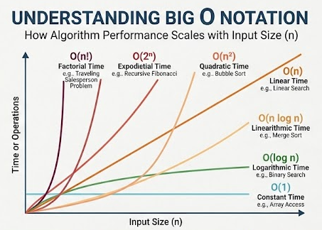
Aesthetic and Minimalist Design is about signal-to-noise ratio. It states that interfaces should not contain information that is irrelevant or rarely needed. Every extra unit of information in a Design competes with the relevant units and diminishes their overall visibility.
Minimalism in UX is not about stripping away personality, making everything flat, or painting the entire app white. It is a functional philosophy: omitting the unnecessary so that the necessary may speak. By keeping interfaces focused and visually clean, you drastically reduce a user’s cognitive load, making it effortless for them to find the information they actually Need.
The Core Metric: Signal-to-Noise Ratio
To master this Heuristic, you must treat pixels and text like valuable real estate. Every element on a screen is either helping the user achieve their goal (Signal) or distracting them from it (Noise).
- Signal: The critical Data, main action buttons, active navigation path, and core content the user came to see.
- Noise: Excessive decorative gradients, repetitive text labels, secondary options competing for primary attention, visual clutter, and unnecessary lines or borders.
An aesthetic and minimalist Design works relentlessly to amplify the signal and ruthlessly eliminate the noise.
Three Core Pillars of Minimalist Design
To create a balanced, high-signal layout, focus on these three core Design principles:
1. Progressive Disclosure
Don’t overwhelm users by displaying every single feature, setting, and Advanced option on the screen at the same time. Show users only what they Need for their current task, and hide Advanced choices a click away.
- Digital Patterns: “Show More” accordion tabs, expandable Advanced settings menus, and Context-dependent toolbars that only appear when an object is selected.
- Everyday Example: When you view a product on a mobile app, you see the price, image, and an “Add to Cart” button. Detailed technical Specifications and warranty fine print are tucked away inside an expandable dropdown lower down the page.
2. Generous and Intentional Whitespace
Whitespace (or negative space) is the empty area between Design elements. It isn’t “wasted” space—it is a powerful tool that gives the user’s eyes a place to rest and creates a clear visual hierarchy.
- Digital Patterns: Relaxed line-heights for typography, wide margins around critical buttons, and large padding gaps separating distinct sections.
- Everyday Example: A well-designed news or blogging website that wraps an article in massive empty margins, forcing your eyes to focus entirely on the text without distraction from busy sidebar ads.
3. Visual Hierarchy and Element Consolidation
Group related items together and use clear typographical contrast (size, weight, and color opacity) to tell the user’s eye exactly what to look at first. Eliminate redundant borders, boxes, and lines by letting whitespace do the grouping for you.
- Digital Patterns: Clean text scales, muted background colors for distinct card elements instead of heavy borders, and unified color accents.
- Everyday Example: A clean modern bank statement displaying a transaction using a large bold merchant name, a smaller grey date below it, and a crisp amount aligned to the right—with zero lines separating the text fields.
Real-World Examples: The Good vs. The Bad
Let’s look at how visual noise impacts the user experience.
The Good: The Modern Search and Dashboard Layout
The textbook classic example of this Heuristic is Google Search. The homepage features a logo, a search bar, and two buttons. Because there is virtually zero noise, the user’s focus is instantly pulled to the input zone. They know exactly what to do.
Another great example is modern Project tracking tools like Linear or Trello. Instead of crowding every single detail onto a task card, they display just the title and a tiny priority icon.
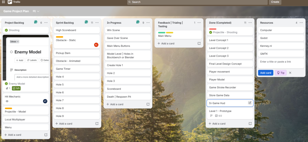
If you Need to see the rest of the metadata, you simply click the card to reveal it in a side drawer—a perfect execution of progressive disclosure.
The Bad: The Flight Booking Wall of Text
Think about booking a flight on a budget airline website that hasn’t updated its layout in years.
When you get to the checkout screen, the page is an absolute sea of text blocks, blinking badges, flashing insurance offers, massive discount banners, car rental advertisements, hotel popups, and three different checkout buttons scattered across the screen.
Because everything is screaming for your attention simultaneously, the visual noise creates immediate anxiety. The critical signal—the actual price breakdown and the “Confirm Payment” button—gets entirely lost in the clutter, leading to accidental misclicks or checkout abandonment.
Further Reading & Deep Dives
To look closer at how visual clarity impacts user trust and how to effectively manage Design complexity, Explore these Resources:
- For a comprehensive deep dive into the psychological benefits of visual simplicity, read the Nielsen Norman Group’s Guide to Aesthetic and Minimalist Design.
- To understand how to use empty space as a structural asset rather than an engineering vacuum, check out their article on The Power of Whitespace in UX Design.
Practice Questions & Quick Quiz
Test your ability to spot visual clutter and apply minimalist principles.
Question 1
A SaaS management dashboard displays a list of active users. Next to every single user’s name in the table, there are five visible icons: Send Message, Edit Profile, Delete User, Suspend Account, and Export Data. The table looks incredibly cluttered and overwhelming. How would you apply progressive disclosure to clean up this UI?
- Answer Key: Instead of showing all five icons for every single Row constantly, hide them by default. You can display them only when the user hovers their mouse over a specific user’s Row, or consolidate all five options into a single, clean “three-dots” (
...) Context menu icon at the end of the Row.
Question 2
True or False: A minimalist Design means you should completely get rid of images, colorful branding, and icons to keep the app as plain as possible.
- Answer Key: False. Minimalism is about removing irrelevant or distracting elements that get in the way of the user’s task. High-quality imagery, clear brand identity, and purposeful color choices can actually improve Usability by making an interface more engaging, recognizable, and pleasant to use.
Practical Activities & UX Challenges
Put these high-signal Design principles to work with these hands-on layout teardowns.
Activity 1: The “Squint Test” UI Audit
Open a landing page or mobile app dashboard that you find slightly confusing or messy. Sit back from your screen, close your eyes halfway, and squint at the interface until the text becomes blurry shapes.
- Task: Analyze what visual elements stand out the most when you squint. Are they the primary action buttons and core content (Signal), or are they huge advertising boxes, bright accent colors on useless decorations, and messy borders (Noise)?
- Deliverable: Draw a quick sketch or list out the top three elements that should be visually toned down, shrunk, or completely removed to make the primary action pop out instantly on the screen.
Activity 2: Designing a Minimalist Product Card
Imagine you are designing the dashboard for an Online portal used by high school technology teachers or Project managers. The dashboard displays ongoing student or team Project portfolios. The current layout shows a massive box for each Project, packed with Data: Student Name, Class Code, Project Title, Date Started, Last Modified, Grade, Number of Tasks Completed, Days Remaining, and an Entire Description Block.
- Task: Wireframe or sketch a redesigned card layout using strict minimalist principles.
- Requirements: Optimize the card layout by meeting these goals:
- Determine the top three most critical pieces of Data a teacher needs to see at a glance (the primary signals) and make them prominent.
- Use progressive disclosure to tuck away the rest of the secondary Data (like description blocks or date details) so they only appear when clicking an info icon or hovering.
- Replace heavy black dividing borders between the cards with intentional spacing and a very subtle background tint to group elements together cleanly.